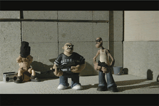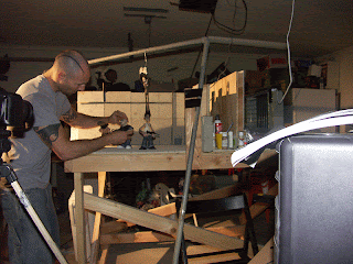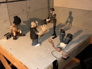


Heres my latest anim. I call it the {ToughGuy test}
Stats
I completed this animation in 2 nights of work. It was 12 hours in total.
I shot this on 2's......This is a first planned{before it was 24 pics a sec}or completely
whatever I felt the animation called for.
I used monkeyjam as the software.....{Planning on giving anasazi a try next}
Shot with a Nikon D 70s and a TamronSP AF Asperical XR 28-75MM1:28 macro Lens
and 1 hour of Sleep...Ha!....just in time for work.
I have been feeling lately that My work is too planned.....I will break down the animation poses.....the Breakdowns...the timing ....my offseting of limbs. I felt it was way too stiff feeling to
always work like this. So I made plans on this shoot to just give myself a base score of actions and then work as I go. This shoot was pretty much straight ahead with an idea....a clear idea though.
Even when I plan out a shot to a heavy degree It never ever has been a straight line to a finished piece......Im constantly Improvising on the spacing and timing as I go. The characters are never in the same relation to each other or the camera .....Stageing is different than you were imagining ....Its a constant adaptation.
love this and Hate it all the same.....I wonder If as I get more experiance this will be less
of an issue than it is in my newbie stage.
I also experianced the art of Flickering images....I didnt really get this problem in my first test......but I think its just the lens I used or the way I unscrewed the lens. Im not really sure if I did it enough or too much?? Like I said ....I'm figuring this all out as I go.
I plan on doing a lens test next week to make sure Im shooting right when it comes down to starting the actual first Shot for my Film.
Things are moving greatly and I feel with each shot I complete my skills are gaining strength.
justin
6 comments:
Dude!!!!
That is so AWESOME!!!
Working straight ahead is definitely working for you. The gestures are perfect, especially when the rich dude comes down like a bolt of lightning. It actually looks like you got him to stretch out!
The ONLY thing that might work a little better done differently is the staging. And the only reason I say that is because, with the rich guy standing behind the tough guys it's a little hard to make out exactly what he's doing. Well, I mean it's pretty clear he's kicking their asses, but I had to watch several times to tell what he did to STG (skinny tough guy)'s face right before he took his gun away. Did he take his mask? Or was it sunglasses? I couldn't quite tell - probably sunglasses because they came off so easily and slid on his face easily too.
Of course one way to remedy that would be cutting to a close-up from a different camera angle for just that little bit of business. Maybe one close-up for when he pulls the glasses off the tough guy's face, and another for when he puts them on himself.
But all that would of course be handled in different shots and edited together.... what you've got here is working beautifully! These characters are not only alive, they've got personality!
Interesting too..... these two dudes are sticking up the dog pound??!!??!?
Ok, I won't ask.... we'll let that be revealed when the film debuts. Maybe they're a little short of kibble.
Ok, watched it a few more times, and a couple more comments I feel I have to make....
I'm loving the widescreen format!
Also, I think things would show up better if you used some fill light coming in from the opposite side from your main light source. Shadows are really dark, and obscure faces and details, occasionally making things hard to see. You could just fix up a piece of posterboard or a big envelope or whatever you have on hand that's white or brightly colored and reflective and aim a light at it. That way you get a diffuse light rather than the sharp light you get direct from the lamp. It might even work to just aim a second light right at the side wall of your set and let it be the reflector, the way it would work in reality. But it's easier to aim a reflector that's off set and can be rigged in various ways.
I almost always use reflected light like that now, and not onlyu that, I use diffusion over my maion lighting as well. It helps to fill in those dark shadows and make everything more clear.
Thanks for the lighting tips Strider! I know its one of my weakest points. So freakin much to learn in this artform.
I like dark shadows sometimes....but I agree completely about losing parts of the chars due to not being lit properly.
I will definately try it on my next shoot.
jriggity
Beautiful man!!! Great poses and action.
I'm all caught up now now and wow. The animation is looking great, Justin (& Shel's super puppets too!) I especially liked the shrug take from the captive guy in the hood--that was a really funny touch!
Insanely great work! Your acting is so fluid and organic.
Post a Comment